
In this blog post, we’re going to take a good look at website footers.
Website footers are often overlooked, which is unfortunate because they are powerful tools for both user experience and SEO.
A general rule of thumb is that you should design your footer with user experience in mind and not SEO. If you focus on the user first, then the rankings will follow. This is because search engine algorithms are continuously evolving to focus on metrics around user engagement: time on page, pages per visit, social likes, and shares. If you’re going to put links in the footer, then you should ask if it helps or hinders the user experience.
Footers are like fashions. Sometimes short ones are all the rage and other times detailed ones are in vogue. We recommend a medium length footer for chiropractors because if you keep it too simple, you’re missing out on some opportunities, and if it’s too long it can be a mess for user experience. The middle ground should always be in style. You should provide just enough information in your footer so that it’s useful for users, but not too much where it’s overwhelming.
Think about how your footer can best serve your users
If a user scrolls all the way down to your footer, it could mean a few different things:
- They were very engaged with whatever content was on that page
- They are searching for something they expect to find in the footer
- They couldn’t find what they were looking for above the fold
With this in mind, here are ways three to make sure that your footer is meeting expectations:
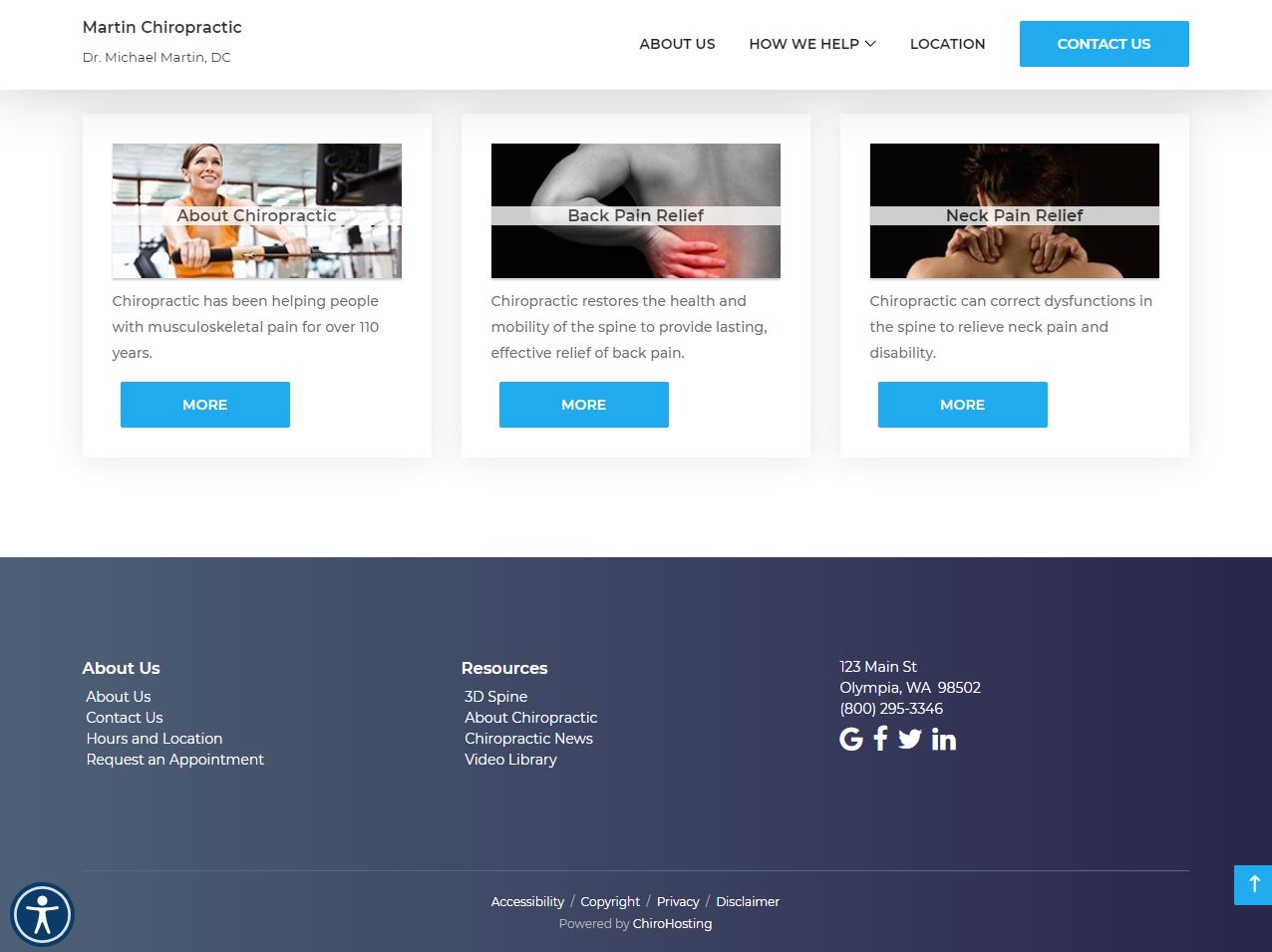
- Add a call to action (CTA) in the footer. If someone was engaged enough to get all the way down to your footer, then they might be interested in taking the next step like getting in touch with your practice or booking their first appointment.
- Make sure that you have the standard footer items in your footer. These include links to your privacy policy, terms and conditions, and social media as well as company information like phone number and address.
- Your footer should be an extension of your top navigation. If a user couldn’t find what they were looking for up top, then your footer is a second chance. With that said, including a mini-sitemap is helpful for users. It acts like a mini table of contents, which makes your site easier to navigate.
Here is an example of a solid footer. You'll notice it contains all three points mentioned above.
If you want us to take a look at your website footer and give you some tailored pointers, we would be more than happy to do so! Drop us a line at support@chirohosting.com. Feel free to take a look at our N8 Chiropractic Website, which has a number of themes with optimized footers.